Creative solution /
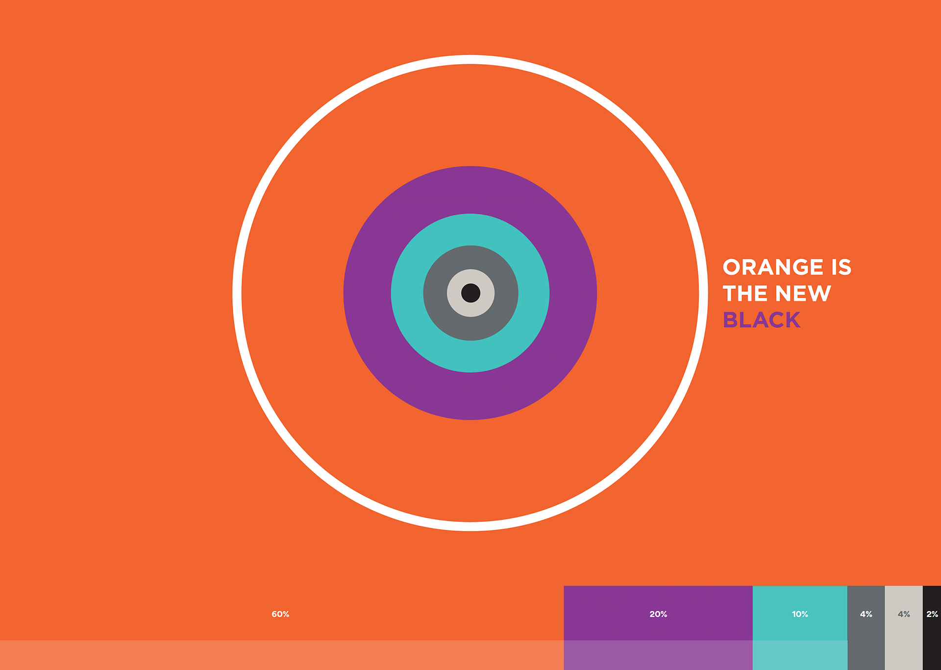
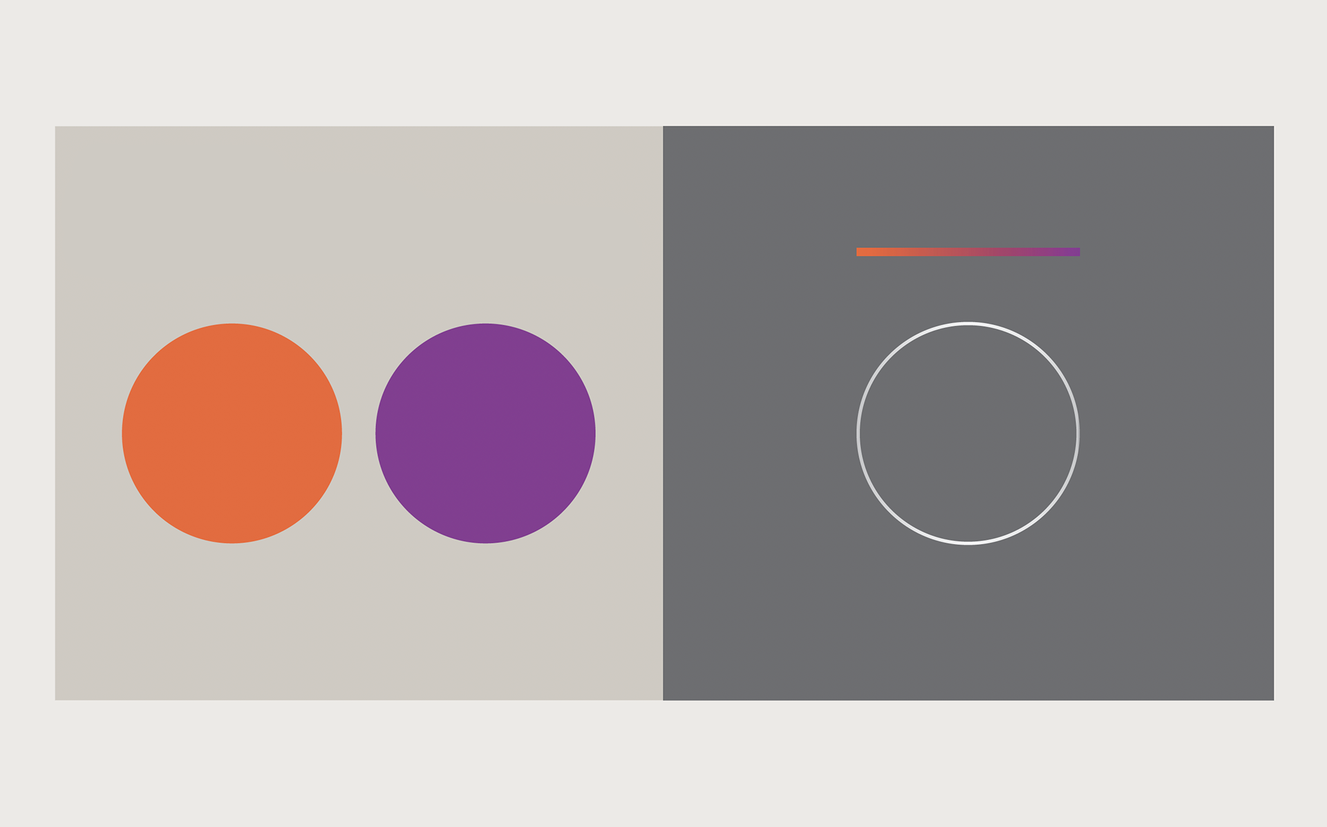
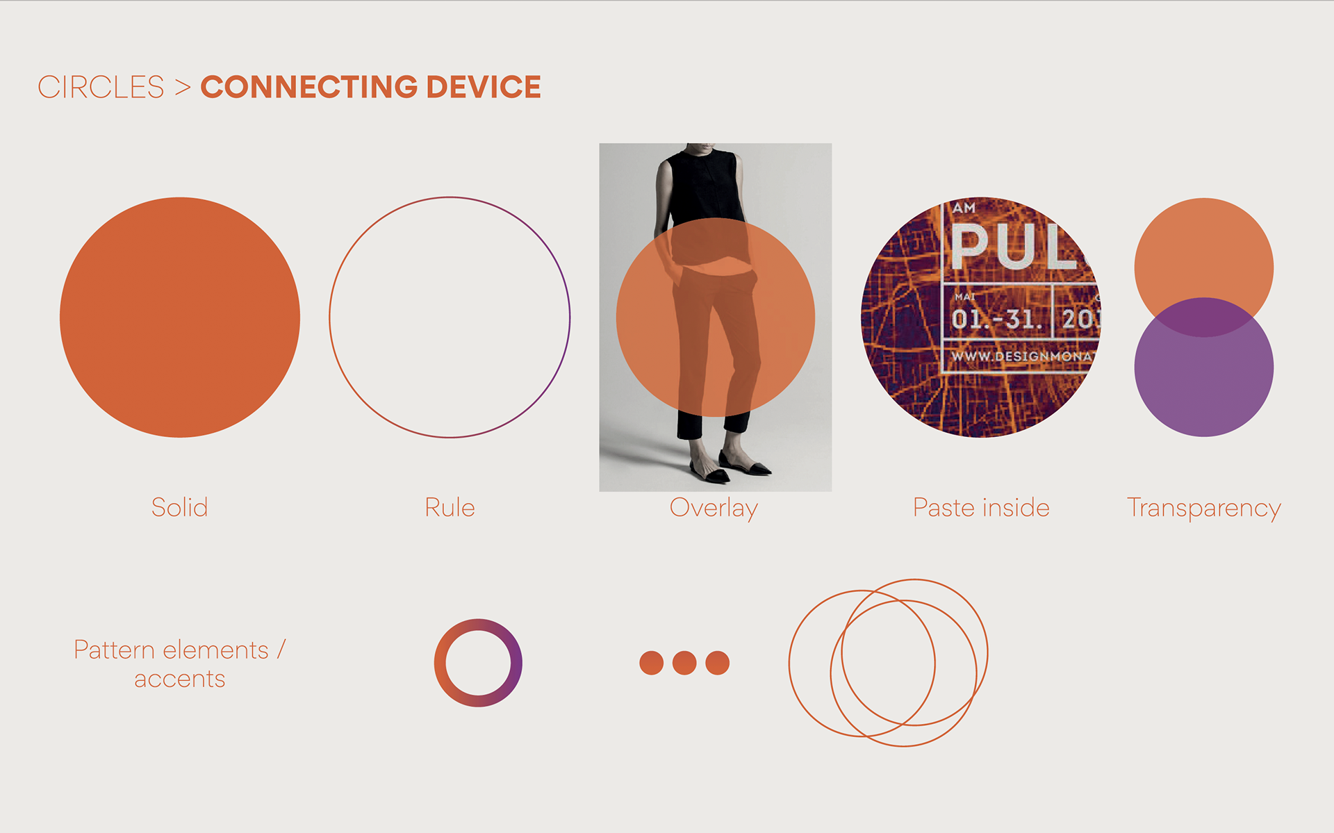
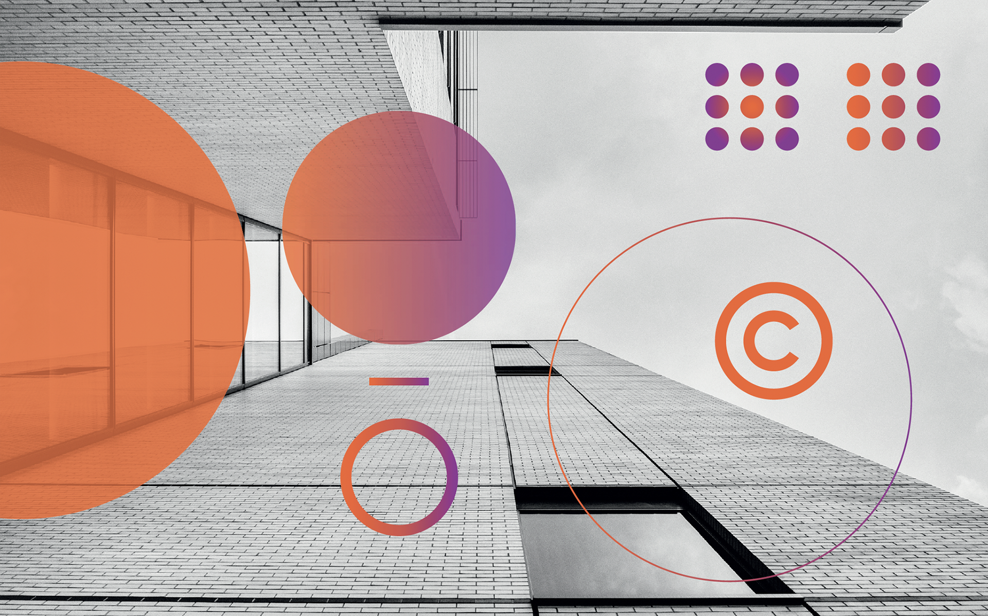
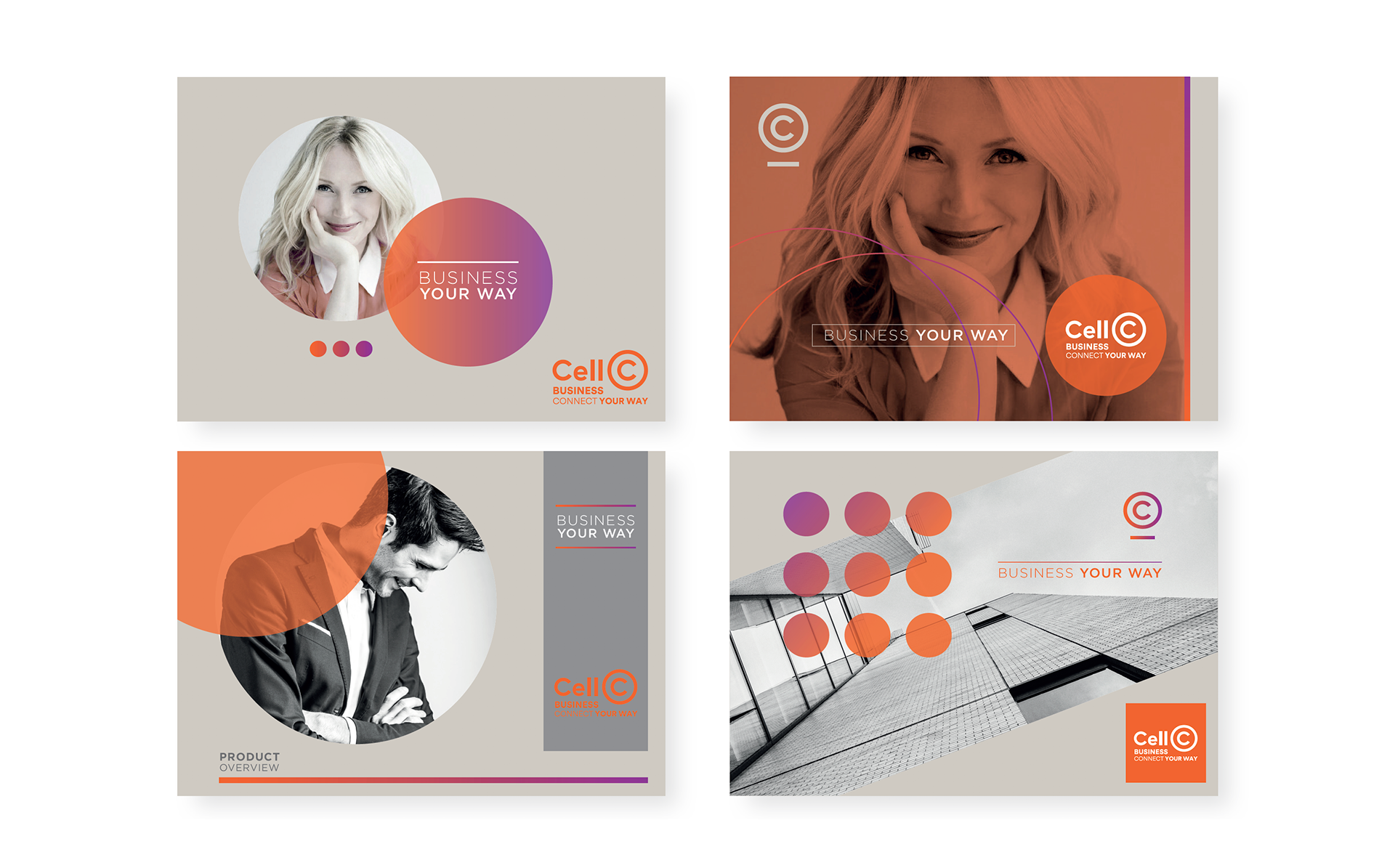
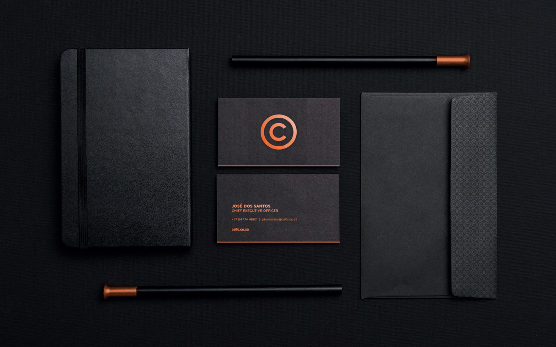
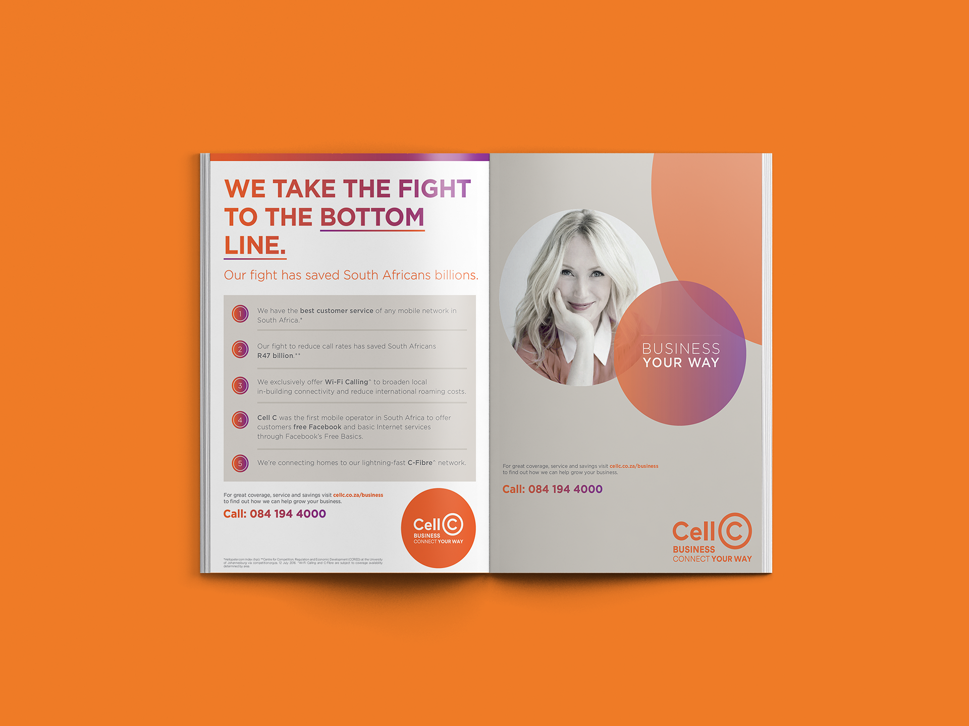
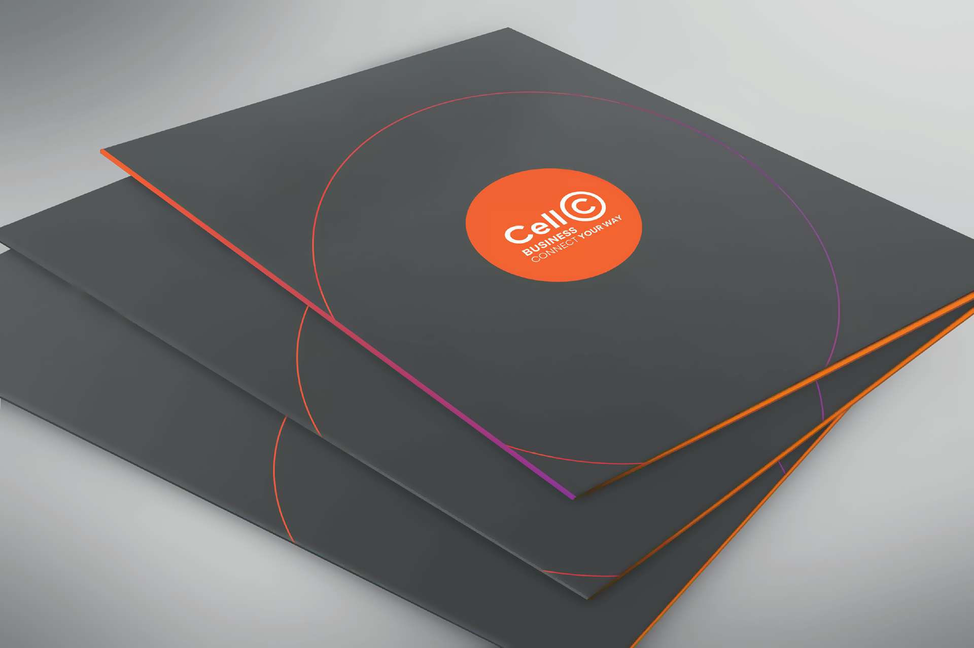
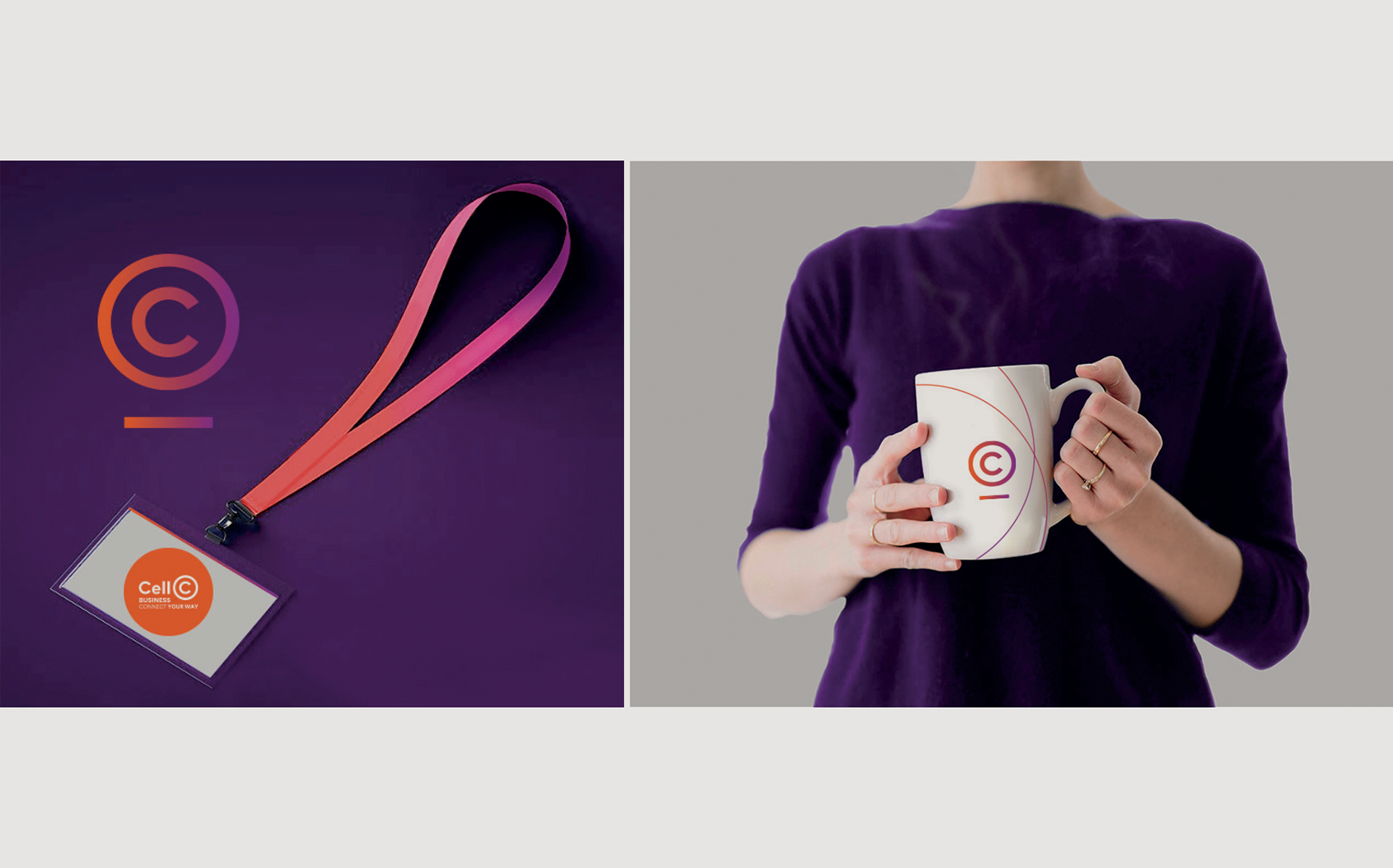
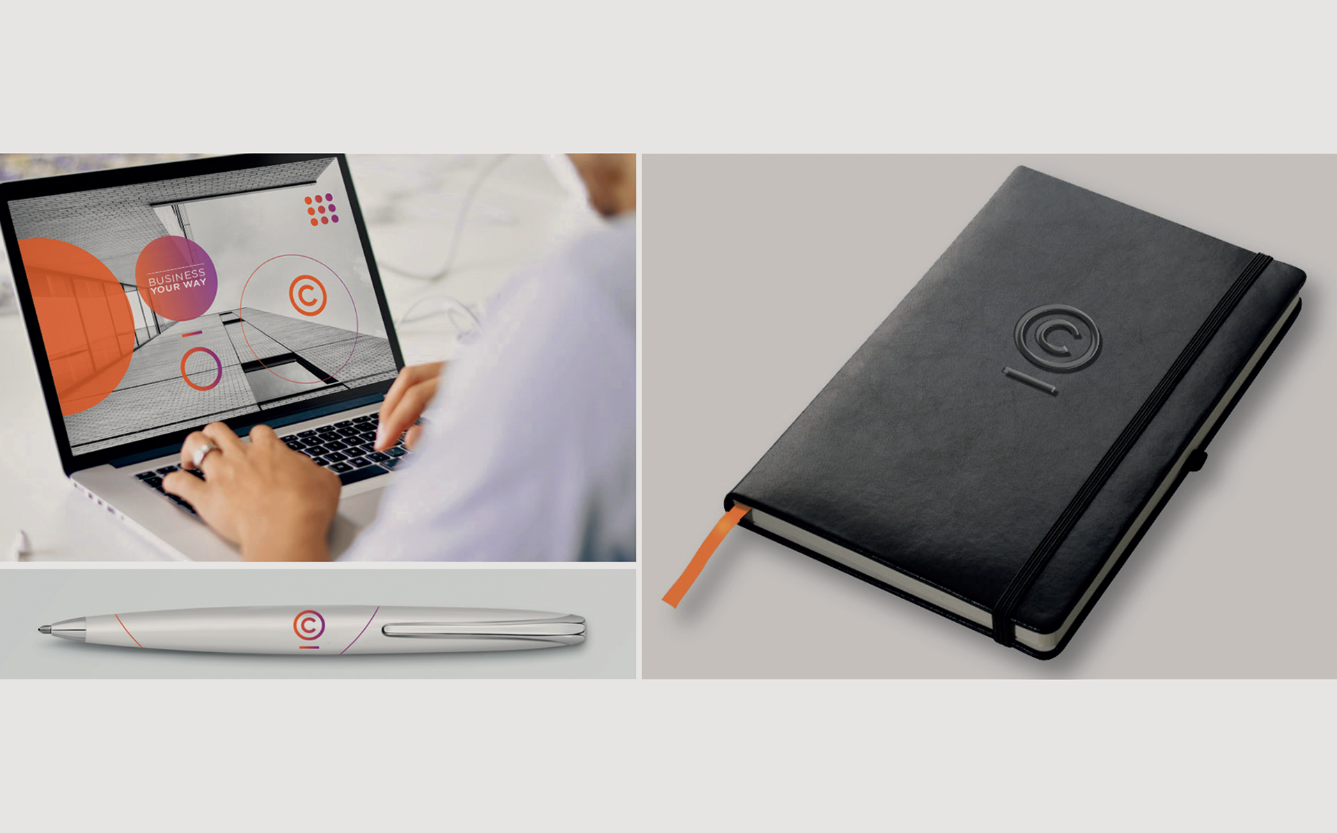
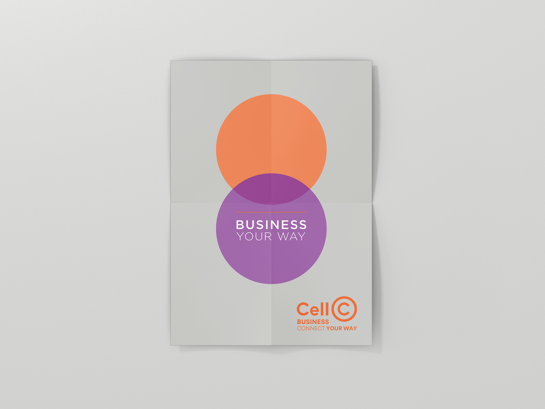
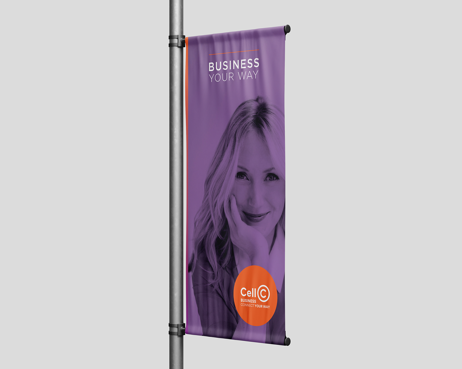
Brand concept and visual language development for Cell C Business. Highlighting sub-brand differentiation through visual cues drawn from the Cell C logo and art direction - the circle as a symbol of connection and introduction of a striking gradient of the Cell C brand's primary colours - orange and purple. The project included design of a modular grid system for brand communications and retail advertising, as well as a brand standards and style guides.
Visual Poetry for McCann 1886 / 2017


#lovewhatwedo